Tuesday, 28 November 2017

Finalising Designs

Below is an Illustration of a cocoa bean branch, a cocoa bean and the inside of a cocoa bean. This illustration shows how much detail is on these cocoa beans.
Because of the company wanting to have the brief solely focused on their 'free range' I decided to take where the chocolate came from and base that on this project.
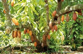
I researched into coco bean trees and they are formed.
Below I found some cocoa bean trees so I could get a more realistic view on them, the way they are formed are very swirly and the branches from which they grow from the roots are very elegant.

I wanted to include how these trees are formed and how the branches are created.
I took how these branches are formed and included it in part of my design for this project.


Cadbury's look in cocoa bean trees is here...

Wednesday, 22 November 2017

Stylish Packaging

I looked more into the different styles of packaging for the chocolate.
I found some stylish packaging that looked a lot more stylish and sophisticated compared to the older ones I found while researching.
Image result for chocolate mature humour packaging
The link for the Mast Chocolate is here.
Looking further into this kind of packaging I found a few I thought was appropriate for this brief.
The 12 shown above seemed relevant to fit the brief for 'mature packaging' because of the limited colour palette used, but looking further into the designs on the packaging I feel that this doesn't suit the brief.

The link to the Hush Chocolate is here.

The packaging shown above is strictly 2 colours, I looked a little further into this company and their packaging and majority (if not all) is black and white, which I may use in my final design (strictly sticking with 2-3 colours.)


The packaging shown above again, is very detailed and has slightly more colour than I had originally thought. I decided not to use this design as one of my influences because the design is too detailed, and I think that covering the packaging itself is too complicated (with the designs themselves, and it also completely covers the packaging.)
I also looked into the company's packaging and they colour co-ordinate the packaging to what flavour the bar is, I may use this as part of my final design also.

Saturday, 18 November 2017

Further Research

I decided to research a little more in depth on what looks appealing to an adult visually.
So I decided to look at certain patterns that would match the flavour of the bar itself.
For example, if there was a strawberry flavour, the background would be pink and covered in strawberries, to make the design not only visible, and simple but also appealing to the eye.
The link the the Hush Chocolate is here.
I looked further into 'mature' packaging so I can base my design on what is more appealing to a more mature audience.
I think the best design for packaging like this would involve something small, simple and sophisticated. 
Related image
The link to this chocolate is here.

Tuesday, 14 November 2017

Changing my idea

After further research it came clear to me that the packaging for this company needs to be a little more sophisticated and clean. So, I decided to keep the design simple but eye catching.
The chocolate packaging shown below is very simple, but gives the message off clearly through the colours, we can colour co-ordinate by saying that the orange, matches the flavour, thus making it simple to identify the different flavours.
Image result for chocolate mature humour packaging

The site to Theo Chocolate is here.

After looking further into the brief, I have realised that the brief specifies that it is solely for the packaging, and that the logo and the text need to be presented how it is exactly on the previous packaging.

My idea for the packaging for this company is to use some classy designs, that look elegant and are eye-catching.
I have decided to look into more simple designs because I don't want to over complicate my design, and I will also need to add the other details that are required on the brief. Such as the logo, text, quotes, etc.
Image result for chocolate mature humour packaging
The site to Rocky Mountain Chocolate is here.

The packaging shown above is a simple design, but it looks like its aimed at a more mature audience, because of the colours used, they are very subtle and the design itself is very simple.
I can use this design as an influence because of how the layout is, and how successful the design is in saying that it looks like its for an older audience.

Tuesday, 7 November 2017

Research


I've noticed that within their packaging they use a lot of humour on it, they have kids on the front of them dressed up (I'm assuming as grown ups) with little sayings like 'don't touch' 'not for kids,' these words and the imaging from what's shown on the packaging is where the humour comes from. I am considering making some cartoon like characters rather than using human faces to illustrate the packaging, to make it more contemporary and more intriguing to look at.

The humour that this company puts on their packaging is aimed for all ages, but the chocolate is mostly aimed at adults, the message is to stop kids from eating this chocolate. 

During my research I did find some packaging to be humorous that only adults would understand.
Although this is funny for adults, the packaging is obviously visible to all public, so I felt like some companies should be a little more                                                     careful with their working on certain packages.

Although I was looking into the different company names, the project is based off the styling of their packaging. This means the colours, what they use with their company names, etc.
From researching into this kind of packaging I will taking into consideration on how to make the packaging look more appealing to adults rather than kids.
The Grown Up Chocolate Company link is here.

Wednesday, 1 November 2017

Choosing Our Brief

Our tutor informed us on doing a live brief. He showed us 3 different sites we could choose from, D&AD, Folio Society and YCN.
Looking at the different sites, there was a variety of different project briefs we could choose from, including designing logos for big brands such as KFC, Bacardi, Dogs Trust and other huge brands.
I did some research into the different live briefs, majority of them are very restricted. For example, the one I chose was Dogs Trust, they wanted us to create a campaign on why rescue dogs, which I felt was more for graphic designers.
After researching into a couple of different briefs I felt the one that worked best for me was a campaign from the YCN site called 'The Grown Up Chocolate Company.' I felt this was the best brief for me, because I didn't want to choose the same brief as everyone else, as well as I like to add a sense of humour within my work (if you look at my previous book arts post I made a ChapBook on 'How To Be Donald Trump') and I felt looking at the packaging of this specific company really influenced me with a few ideas I can take forward, I also really like designing designed backgrounds. Which I felt was a perfect fit for me.